Uplight
A marketplace any utility can make its own
Designed the configurable system that lets any utility brand Uplight’s Marketplace as its own store, and authored the onboarding guide that turned a bespoke setup into a repeatable, accessible launch.
7
Configurable brand elements
WCAG AA
Held across every utility brand
2
Brandable typefaces (headline + body)
Onboarding
Bespoke setup became a guide
One store, every utility’s brand
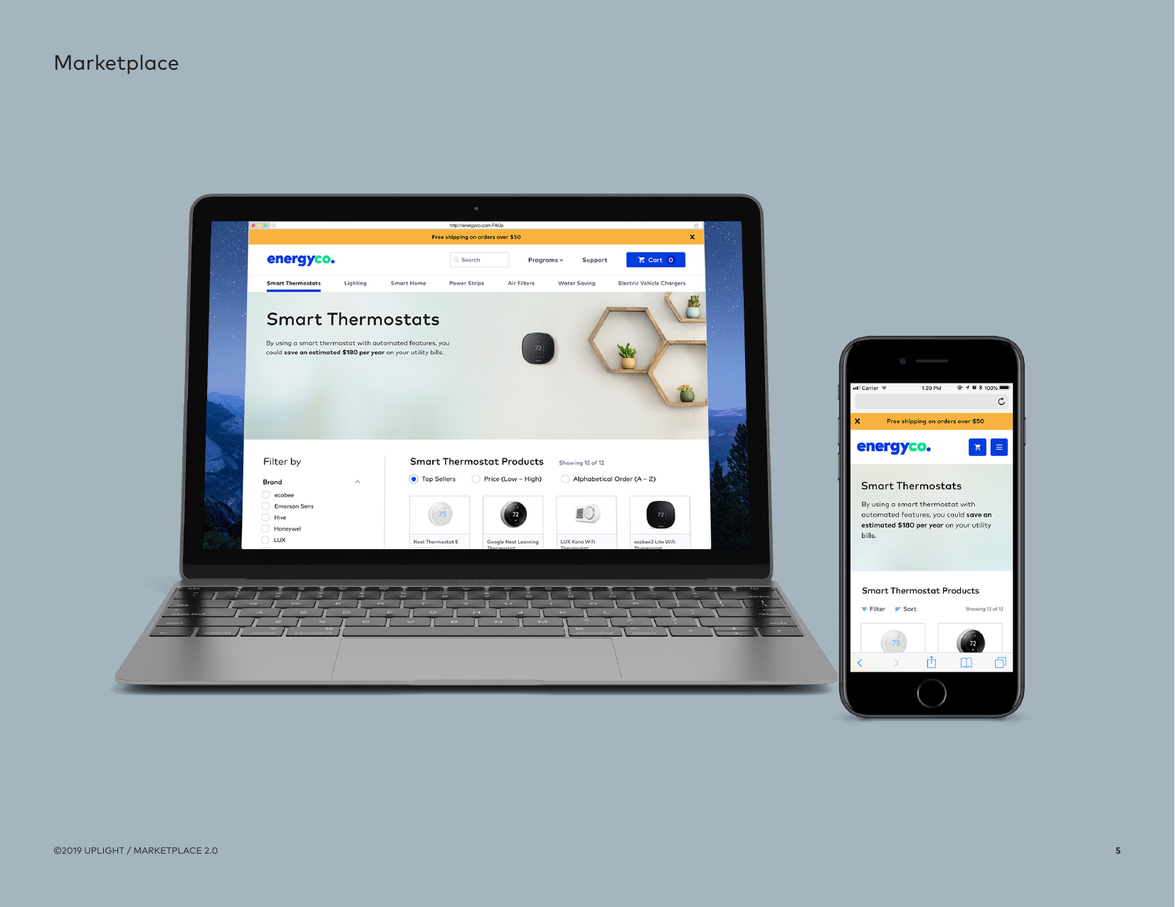
Uplight’s Marketplace is a white-label e-commerce platform that energy utilities use to sell efficiency products, smart thermostats, LED lighting, EV chargers, with instant rebates baked into the price. The catch is that it can’t look like Uplight: each utility runs the store as its own branded shop, from the logo down to the footer.
I worked across Uplight’s product lines as a product designer, and owned the part of Marketplace that made that white-label promise real, the configurable system, and the onboarding that gets a new utility live on it.
- White-label store for energy utilities
- Sells efficiency products with instant rebates
- Each utility brands it as its own shop
Make it brandable without making it inconsistent
Every new utility meant re-skinning the store, and doing it by hand was slow, error-prone, and easy to get subtly wrong, an off-brand color here, a failed contrast check there. The design problem wasn’t a screen; it was a system: what exactly can a client change, and what has to stay fixed so the experience never breaks?
And it had to be repeatable. Onboarding couldn’t depend on a designer hand-holding every launch, it needed to be something a project manager and a client could run together.
“White-label design isn’t about one beautiful screen. It’s about deciding what a hundred different brands are allowed to change, and what they aren’t.”
The guardrails that keep every brand coherent
I designed the configuration around a tight set of rules, so brand freedom never came at the cost of usability or accessibility.
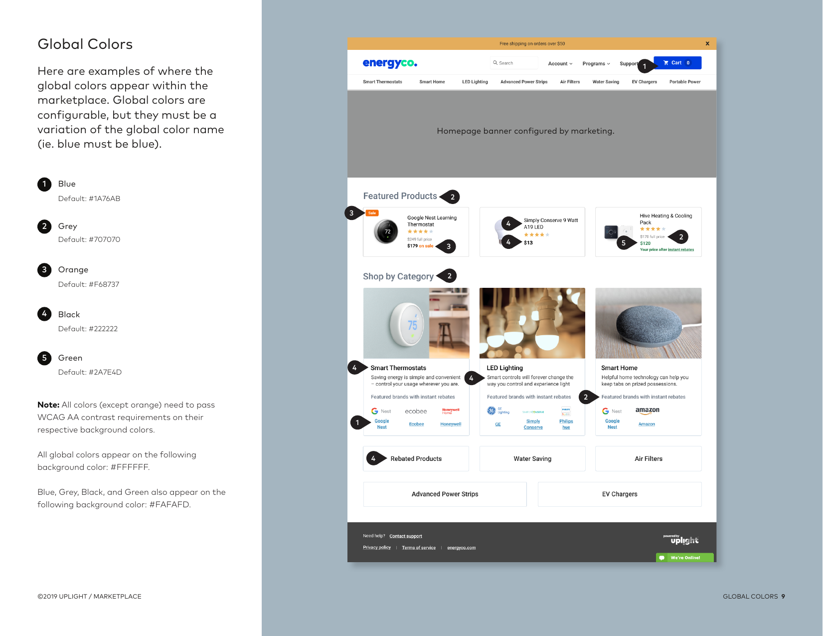
- Every configurable color must pass WCAG AA contrast on its background
- Brand colors must stay true to their semantic name, blue has to read as blue
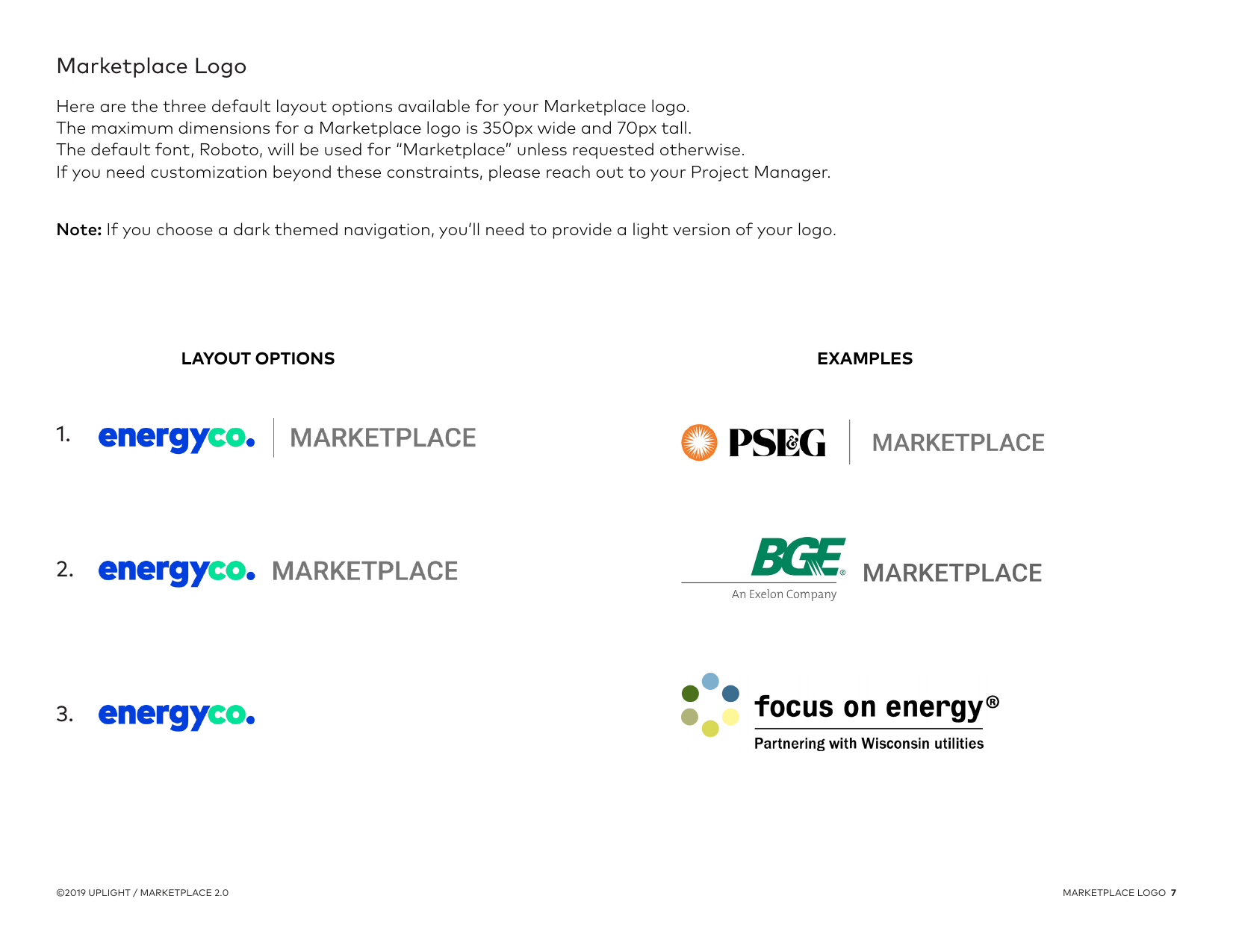
- Logos cap at 350×70; dark navs require a light logo variant
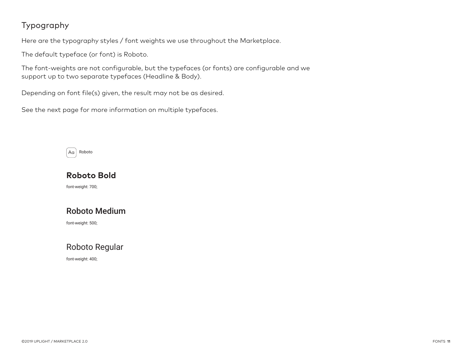
- Font weights are fixed; clients may swap up to two typefaces (headline + body)
A configurable system with fixed semantics
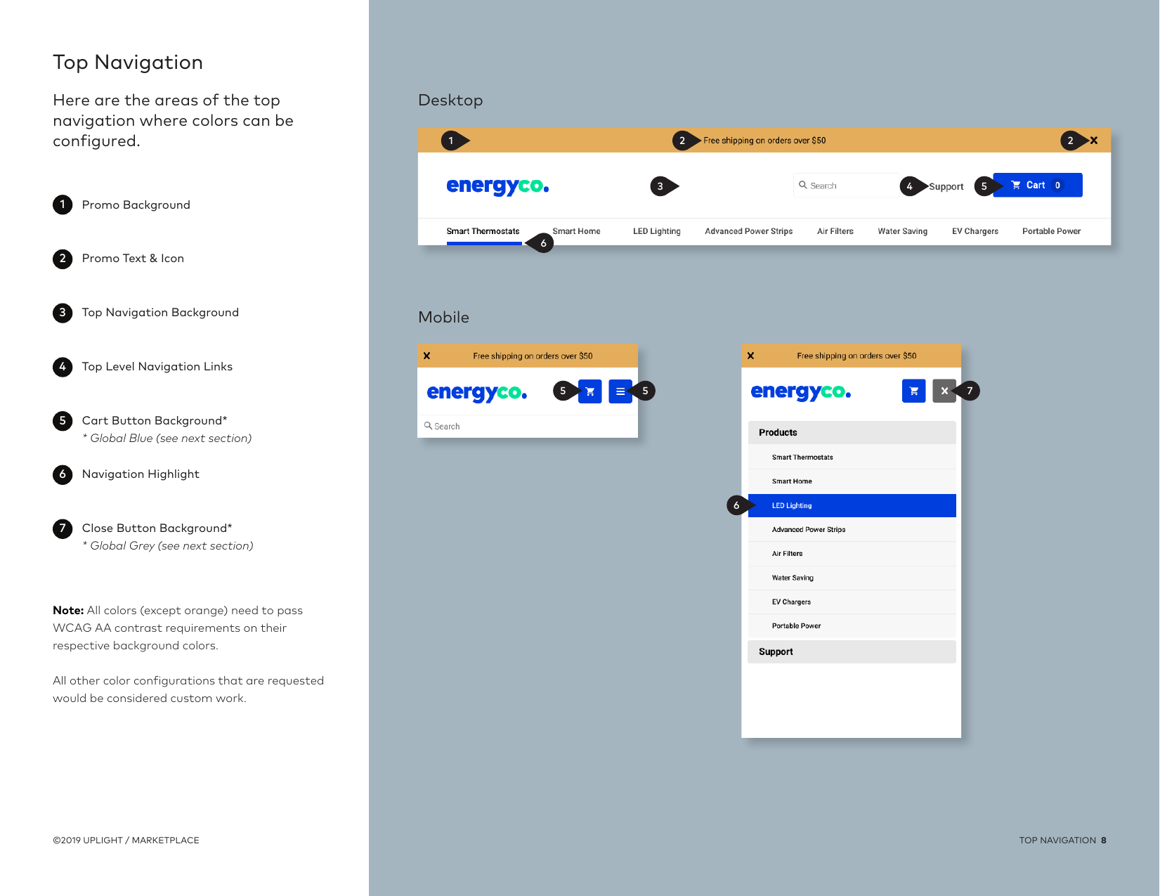
I broke the store into seven configurable elements, name, logo, top navigation, global colors, footer, typography, and a multi-typeface option, and defined exactly how each one behaves when a utility supplies its brand.
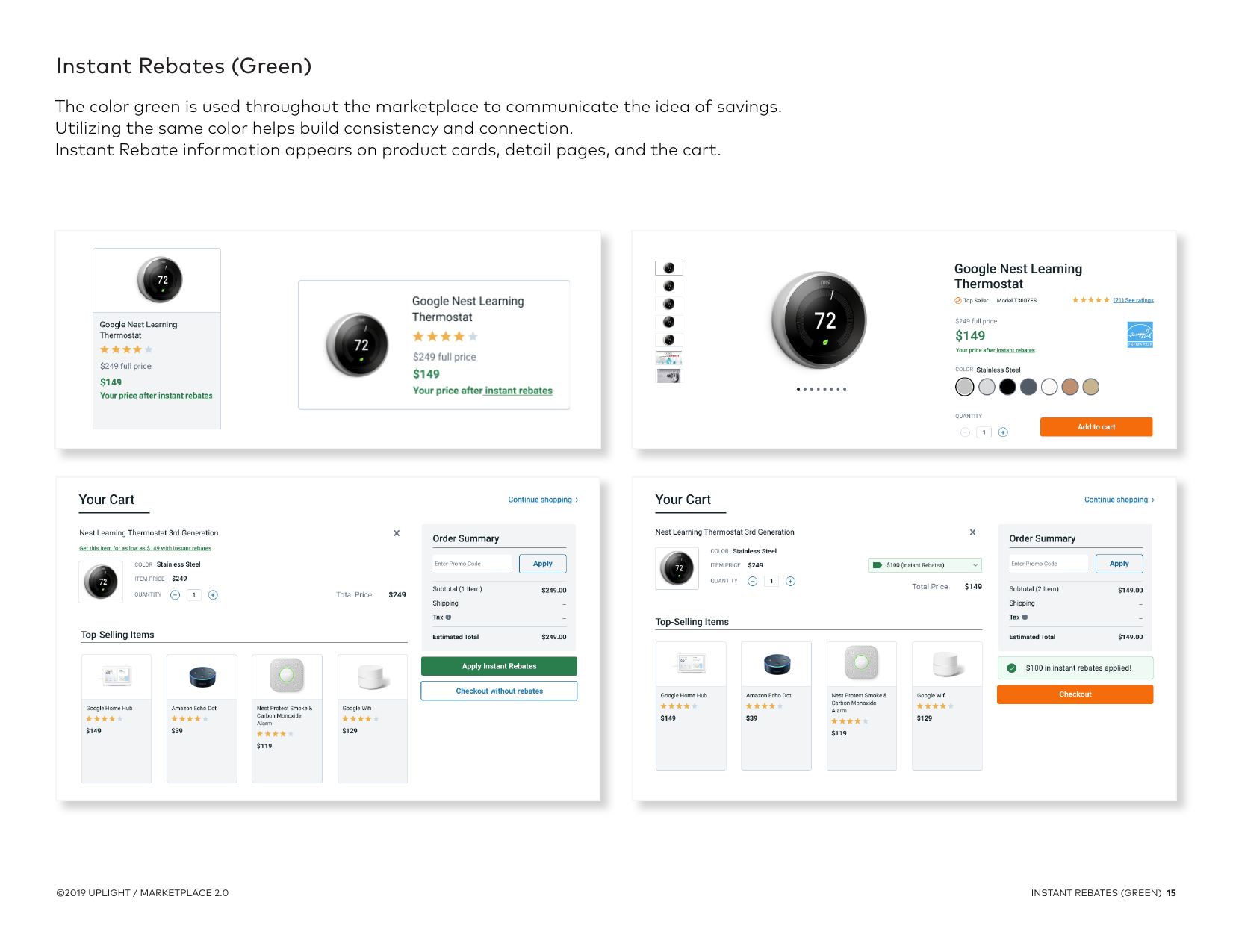
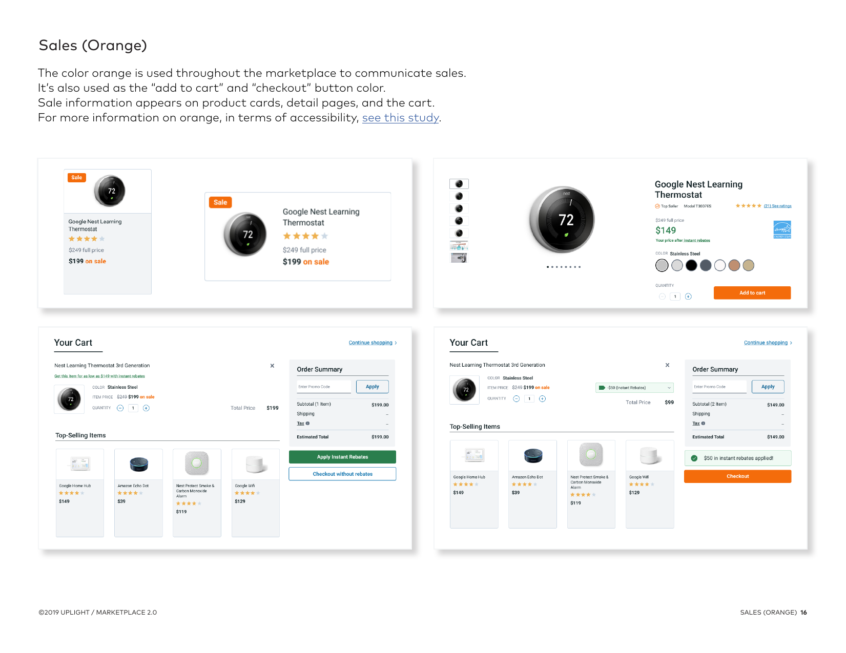
The key move was separating brand from meaning. A utility can change its palette, but the semantic colors hold across every instance: green always signals savings and instant rebates; orange always signals a sale and drives the add-to-cart and checkout actions. That’s what lets the same UX feel native to PSEG, BGE, ComEd, or Focus on Energy without re-teaching customers what a color means.
- Seven configurable elements, each with clear behavior
- Semantic color held constant: green = savings, orange = sales/CTAs
- Up to two brand typefaces mapped to five headline regions
- Program pages slot into the nav for utility-specific content
The Marketplace Configuration Guide
To make onboarding repeatable, I authored the Marketplace Configuration Guide, a single document that turns a bespoke setup into a clear, self-serve-ish process. It tells a utility exactly what to send (brand colors as Hex/RGB/CMYK, no Pantones; a vector logo; font files; any web style guide), walks through every configurable element with examples, and explains the semantic color and accessibility rules up front.
It’s the artifact that streamlined client onboarding: instead of a back-and-forth discovery for every launch, a project manager and client can follow one guide and get a branded, accessible store live.
- Defines the exact brand assets a utility must provide
- Shows layout options and real examples (PSEG, BGE, Focus on Energy)
- Bakes accessibility and semantic color into the instructions
- Turned per-client discovery into a repeatable launch
A repeatable, accessible, on-brand launch
The result is a system where any utility can stand up its own Marketplace, fully branded, accessible by default, and consistent with the patterns customers already understand. The configuration guide gave product managers and clients a shared playbook, which is exactly what streamlined onboarding looks like in practice.
- Utilities run their own branded store on one shared system
- Accessibility (WCAG AA) guaranteed by the configuration rules
- Onboarding shifted from bespoke to guided and repeatable
What I’d carry forward
White-label work taught me that the real deliverable is a system of constraints, not a comp. The hard, valuable decisions were about what to lock down, semantics and accessibility, so that everything else could safely flex.
And documentation is design. The configuration guide did more to scale Marketplace than any single screen, because it let other people launch the experience correctly without me in the room.
Currently open to new roles
Let’s make somethingclear.
Senior, Staff, Lead, or Design Manager, if you’re untangling something complicated and want a designer who thinks in systems, I’d love to hear about it.