Michael J. Fox Foundation
From discovery to delivery for a Parkinson’s leader
Co-built the Michael J. Fox Foundation’s website at Mondo Robot: UX discovery at scale, a value-exchange strategy for two very different audiences, and the interactions and motion that brought it to life.

269K
Audience surveyed (patients + researchers)
3,800+
Survey responses synthesized
7
Discovery methods, audit to workshop
3
Strategic areas of opportunity
The heart of a Parkinson’s leader’s digital ecosystem
In July 2016, the Michael J. Fox Foundation sought a partner to co-build a new website that reflects its brand and its role as a visionary funder in the Parkinson’s field. The site sits at the heart of the Foundation’s digital ecosystem and is its primary channel to a large, diverse audience.
It’s a platform for education, research tools, and action, and it had to empower in-house teams to manage a flexible, scalable system as the Foundation’s needs evolved. I joined the engagement at Mondo Robot to help figure out what we should build, and why.
- MichaelJFox.org: education, research tools, and action in one platform
- The Foundation’s primary channel to a large, diverse audience
- Co-built, with a flexible system for in-house teams to manage
One site, two audiences, and a value exchange to strengthen
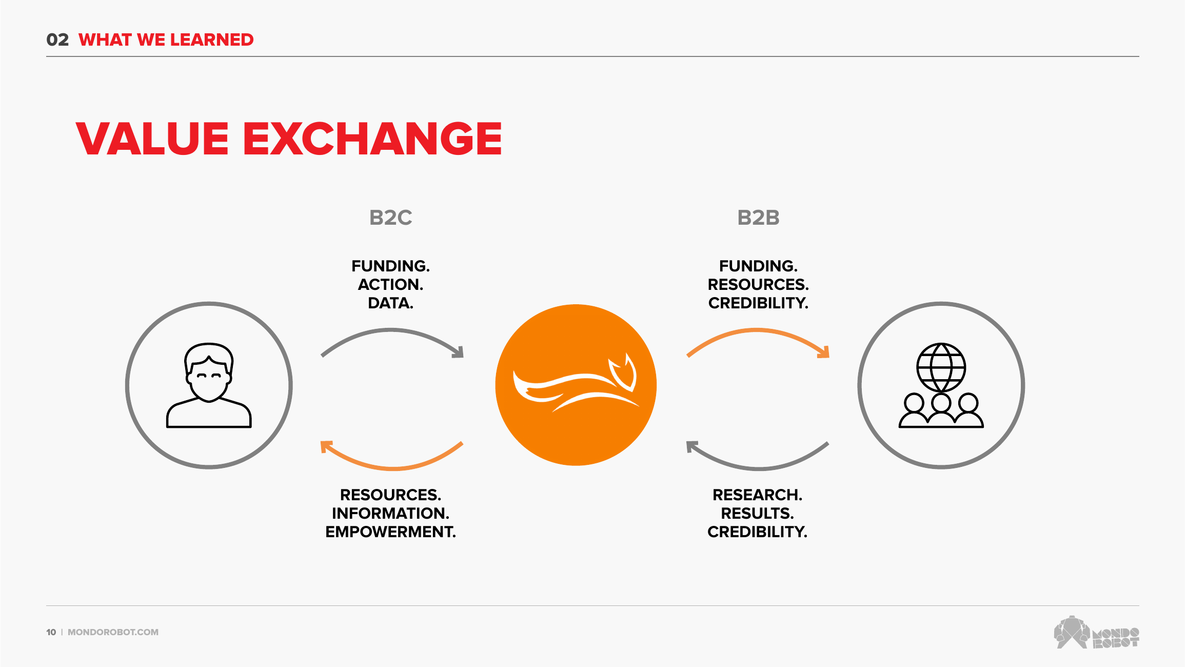
The defining insight from discovery was structural. MichaelJFox.org is the catalyst for a value exchange between two very different audiences: B2C (patients, family, and friends) who give funding, action, and data, and B2B (researchers, clinicians, and industry) who give back research, results, and credibility.
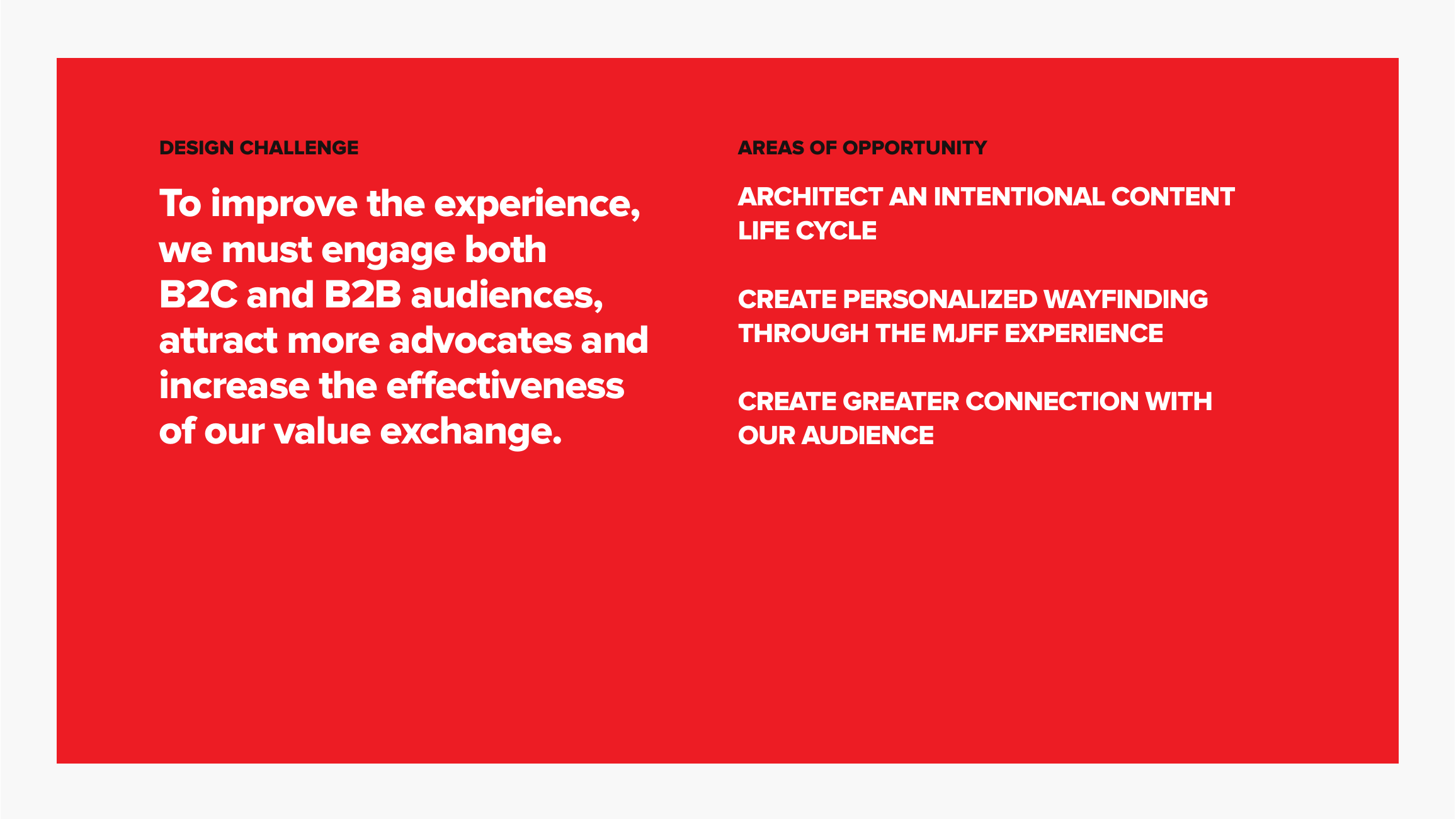
Analytics underlined the urgency: roughly 70% of visitors saw only a single page, and nearly half spent under a minute on the site. The design challenge became clear, improve the experience to engage both audiences, attract more advocates, and increase the effectiveness of that value exchange.
“Generally, I have to click around to get a sense of where information resides. The info is good when I find it, but it isn’t as well organized as it could be.”
Seven ways of listening before designing
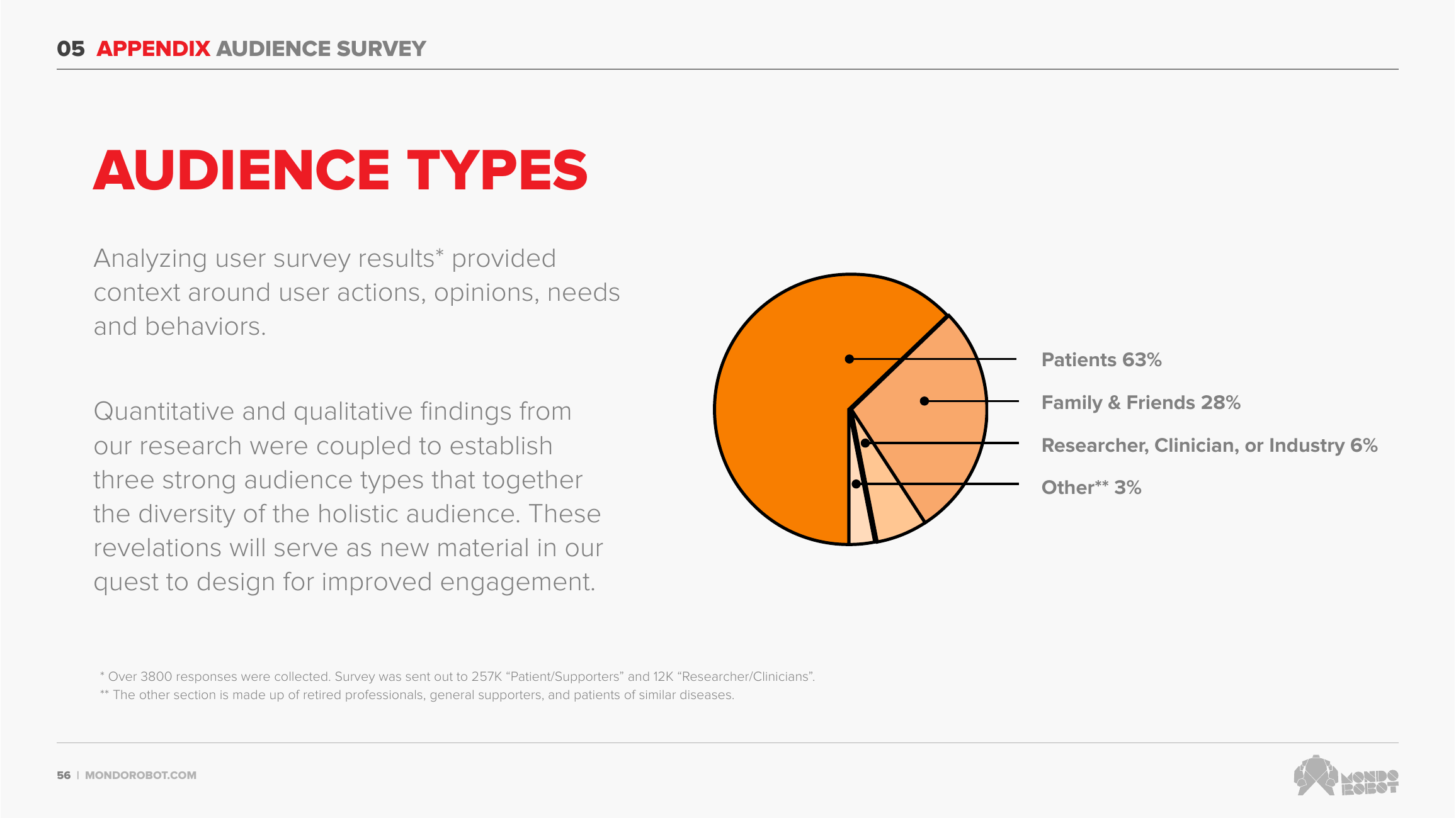
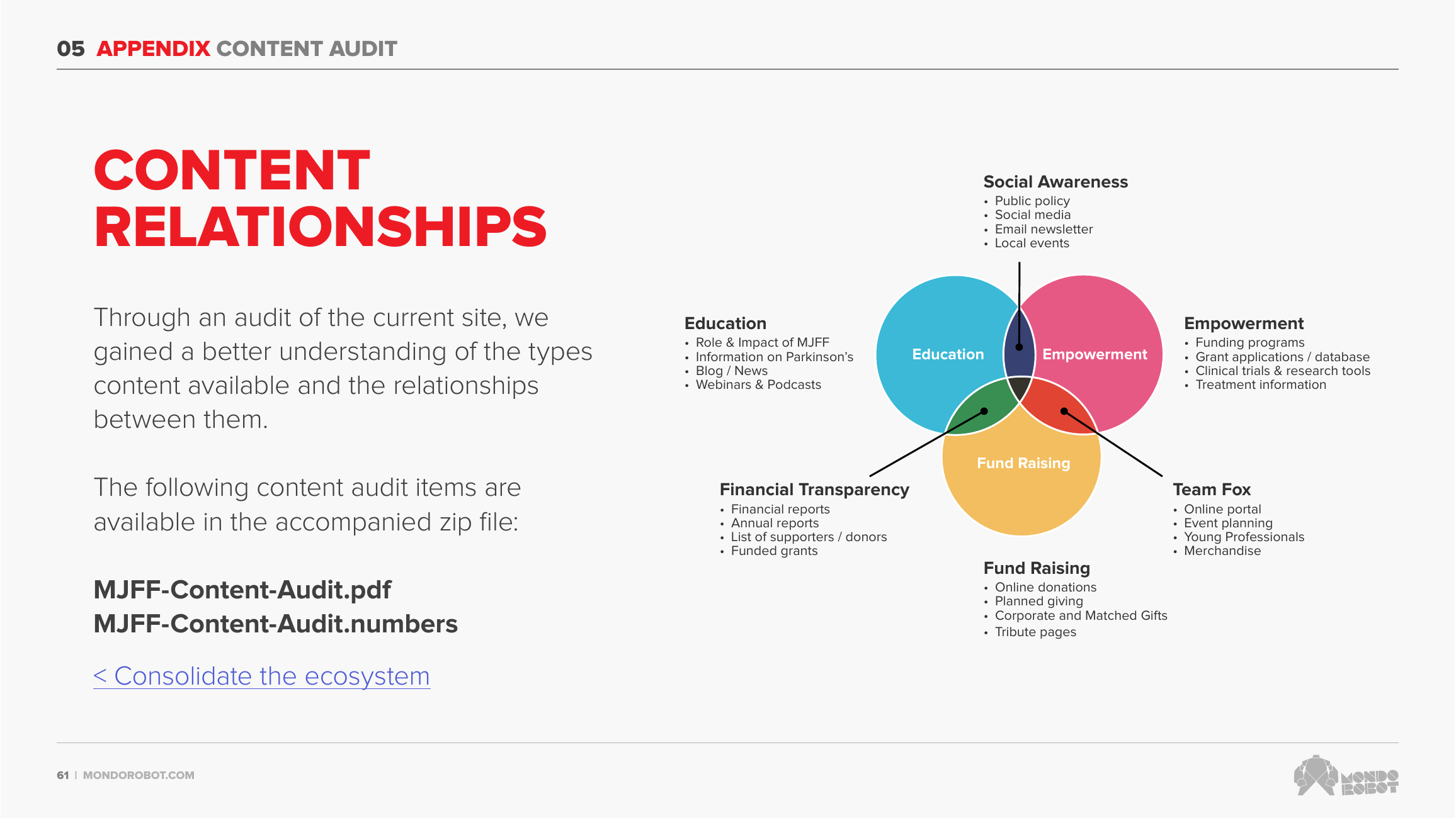
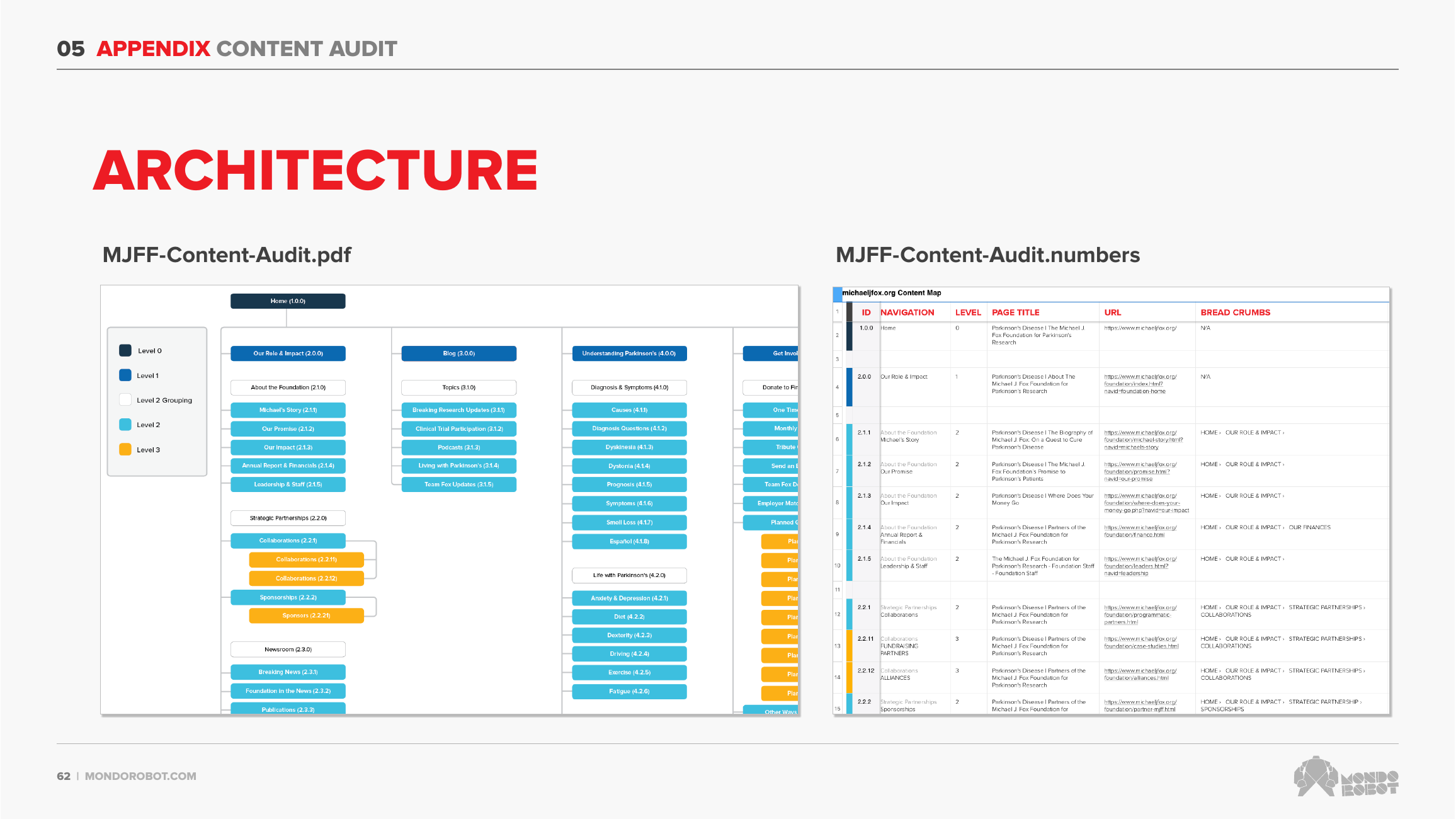
Discovery was deliberately broad, and it was real research rather than a checkbox. We ran a content audit, a competitive analysis, a comparative analysis of more than 30 organizations, stakeholder interviews, an analytics review across Google and Adobe, and a user survey sent to roughly 269,000 supporters and researchers that returned over 3,800 responses.
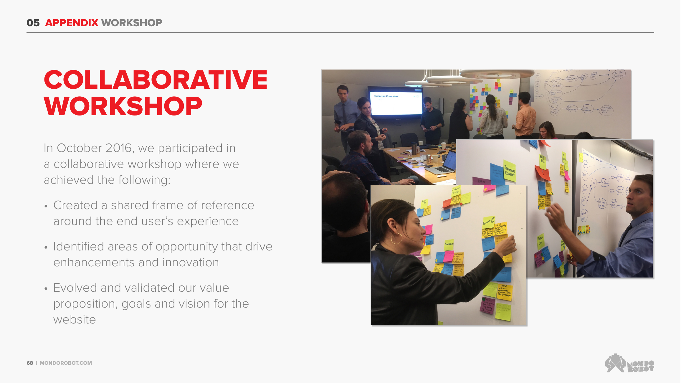
We synthesized all of it, then met in person for a collaborative workshop in October 2016, mapping the existing flows step by step and capturing How Might We notes that we organized and prioritized as a team.
- Content audit, plus competitive and comparative analysis (30+ orgs)
- Stakeholder interviews and an analytics review (Google + Adobe)
- A survey to ~269K supporters and researchers, 3,800+ responses
- A collaborative workshop mapping real task flows
Four journeys, framed as “How Might We”
We mapped four real journeys step by step and turned each into How Might We questions to steer the design:
- Patient searching for dystonia treatment: HMW personalize by location, improve on-site search, and eliminate dead ends?
- Family member looking to donate: HMW make giving easier across web, mobile, and wallet, and show where donations go?
- Researcher seeking an animal model: HMW reduce clicks and better organize the research-tools catalog?
- Patient seeking a new therapy: HMW explain the latest trials in layperson’s terms and convey real momentum?
Three areas of opportunity, one vision
All of that synthesis pointed to three strategic areas of opportunity. First, architect an intentional content life cycle, so content is showcased, made comprehensible in plain language, and richly related to other content. Second, provide personalized wayfinding through a fragmented ecosystem of subdomains and separate properties: clear information architecture, better navigation, a consolidated experience. Third, create greater connection with the audience through personalization and a genuine sense that what people do has impact.
These rolled up into a vision and a brand personality, approachable, optimistic, straight-forward, knowledgeable, innovative, that gave the whole team a shared compass for every decision that followed.
“MichaelJFox.org gives audiences a clear, guided journey through their Parkinson’s experience, empowering them to make a positive impact on PD research over time.”
From strategy to subtle, brand-reinforcing motion
With the strategy set, I focused on the interactions and animations, intentionally subtle moments meant to reinforce the brand while improving clarity, flow, and usability.
I worked closely with the front-end engineering team so the ideas translated cleanly into production, documenting each interaction with detailed notes and behavior guidelines to keep design intent and implementation aligned.
- Subtle, brand-reinforcing motion, not decoration
- Detailed interaction notes and behavior guidelines
- Tight partnership with front-end engineering
What I’d carry forward
The most valuable thing I did here was reframe a website project as a value-exchange problem between two audiences. That single lens made the priorities obvious and gave a sprawling content ecosystem a reason to get organized.
And broad, honest discovery earns the right to design. The survey, interviews, analytics, and workshop weren’t throat-clearing; they’re what made every later decision defensible, all the way down to the motion.
A selection of the subtle interactions and animations I designed for the site, documented for engineering and built into production.
Currently open to new roles
Let’s make somethingclear.
Senior, Staff, Lead, or Design Manager, if you’re untangling something complicated and want a designer who thinks in systems, I’d love to hear about it.