Pellucid Analytics
From raw data to a credible chart, fast
Designed core product UI and data visualizations for a tablet and browser platform that helped advisory professionals turn raw financial data into credible charts and decks in a fraction of the usual time.
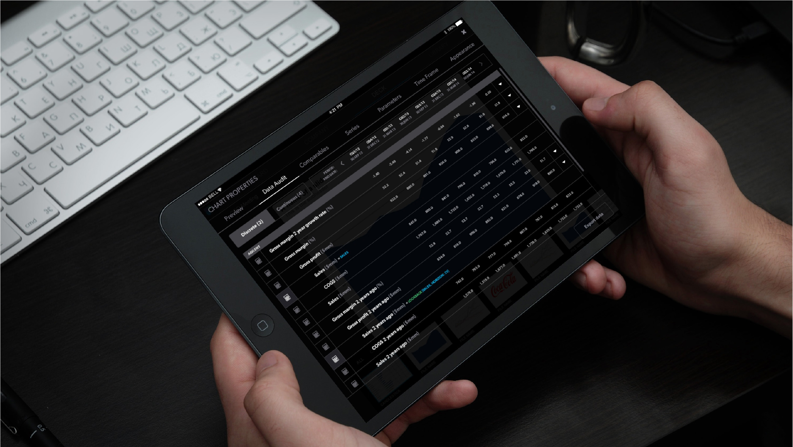
Tablet + browser
One product, two surfaces
Raw data → deck
The full path, in one tool
3 months
Design ran ahead of development
Agile sprints
Shipping designs every cycle
Everything an advisor needs, in one place
Pellucid Analytics was building a tablet and browser-based software solution for advisory professionals, the bankers and analysts who live in financial charts and pitch decks. The goal was to pull every capability they rely on, business intelligence, data visualization, collaboration, and presentation, into a single integrated tool.
The promise was speed without sacrificing rigor: users could go from raw data to powerful visualizations and compelling stories in a fraction of the time and effort it used to take. I designed core product UI and the data visualizations that carried that promise.
- Audience: advisory professionals, not casual users
- Two surfaces: tablet and browser, one coherent product
- Scope: raw data, visualization, collaboration, presentation
The old way was slow, manual, and hard to trust
Building the charts behind an advisory deck was painstaking. Pull data from multiple sources, wrangle it in spreadsheets, rebuild the same chart formats by hand, then paste it all into a presentation, and do it again the moment a number changed. The work was slow, easy to break, and difficult to audit.
For this audience the stakes are real. A chart in a client deck has to be right, and it has to be defensible. So the design challenge was twofold: make the data legible at a glance, and make its provenance obvious, so a user could trust the number and prove where it came from.
Agile sprints, design running ahead of build
We worked in agile sprints, delivering designs roughly three months ahead of development. That cadence kept a steady backlog of resolved, validated design in front of the engineering team, so build was never waiting on decisions and design had room to think a few steps out.
My part of the work moved from wireframes into prototypes and high-fidelity UI, defining how dense financial information should be structured, navigated, and read on both tablet and browser.
- Designs delivered ~3 months ahead of development
- Wireframes → prototypes → high-fidelity UI
- Steady, validated handoff every sprint
Making every number traceable
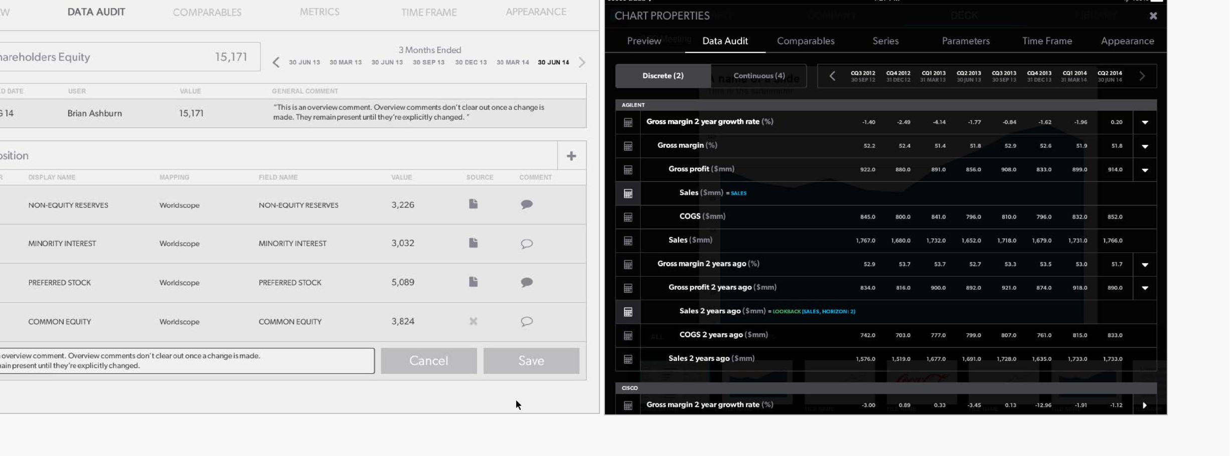
The hardest and most rewarding piece was Data Audit, the part of the product that let users see exactly how a value was composed. A figure like Shareholders Equity is not one number, it is a stack of inputs, non-equity reserves, minority interest, preferred stock, common equity, each mapped to a source and open to comment.
I designed this from wireframe through to high-fidelity UI. The interface had to expose operators, display names, source mappings, values, and revision history without drowning the user, so that trust was built into the screen rather than taken on faith. The high-fidelity version held that density in a calm, dark, focused layout that read clearly even when the table was full.
- Composition view: every input mapped to a source
- Comments and revision history kept with the data
- Density handled without losing legibility
“For this audience the design problem was never the data. It was meaning, legibility, and proof.”
A deck's worth of visualizations, ready to use
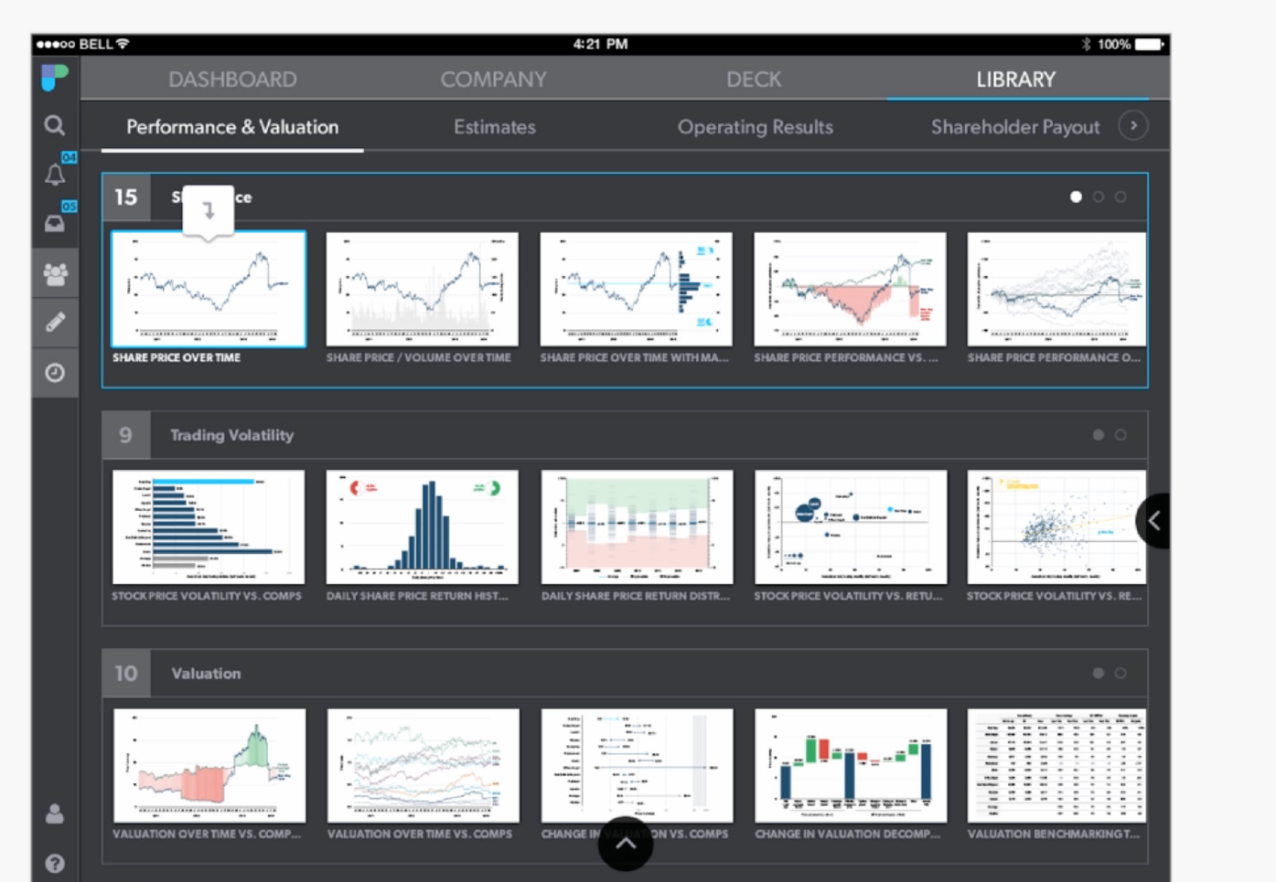
Beyond the audit trail, the product offered a deep library of finance-specific visualizations, share price over time, trading volatility, valuation versus comparables, and many more, organized so a user could browse, preview, and pull the right chart into a story.
Designing this meant building a visual system that stayed consistent across dozens of chart types and held up on both a tablet screen and a browser, so the output looked credible the moment it landed in front of a client.
What I'd carry forward
With an expert audience, you design for trust as much as for clarity. The most valuable thing I built here was not a prettier chart, it was a way to see where a number came from, and that is what made the speed worth anything.
Working three months ahead of development taught me to hold a long view and a short one at once: resolve the system far enough out that build never stalls, while keeping each sprint's handoff concrete enough to ship.
Currently open to new roles
Let’s make somethingclear.
Senior, Staff, Lead, or Design Manager, if you’re untangling something complicated and want a designer who thinks in systems, I’d love to hear about it.