Heady Coffee Co.
Branding a coffee shop into an existing family
Created the brand identity and logo for Heady Coffee Co., a Boulder coffee shop and sister company to McDevitt Taco Supply, building a fresh mark that still reads as part of the same family.
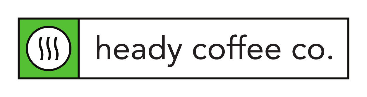
Sister brand
Visual sibling to McDevitt Taco Supply
Steam mark
One icon, instantly coffee
Green + black
Shared family palette
Lockup set
Square, circle, and boxed variants
A new coffee brand, born into a family
Heady Coffee Co. is a Boulder coffee shop and the sister company to McDevitt Taco Supply. That relationship was the whole brief. Heady needed its own identity, clearly a coffee brand and not a taco joint, but a customer who knew one had to feel the other in it right away.
So this was less a blank-page logo and more a family-portrait problem: design a sibling. Find the shared features that make the two unmistakably related, then give Heady a personality of its own.
There was even a verbal thread to pull on. McDevitt's own menu calls them super heady tacos, so the name Heady Coffee Co. let the two brands rhyme out loud, not just on the page.
- Sister company to McDevitt Taco Supply
- Must stand alone as a coffee brand
- Must read as part of the same family
Inheriting the family features
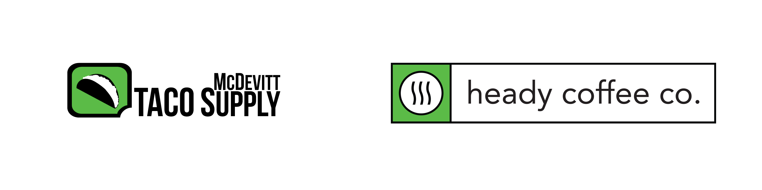
I started by naming what made McDevitt look like McDevitt: a bright, almost electric green, a heavy black outline, and an icon tucked inside a bold container, the taco sitting in a chat-bubble block. That trio is the genetic code of the brand.
Heady would keep all three. Same green, same confident black line weight, same idea of a single symbol living inside a strong shape. With the backbone settled, the only real question was the symbol and how to house it.
“Designing a sister brand is about resemblance, not repetition. Keep the bones, change the face.”
From coffee cups to a third eye
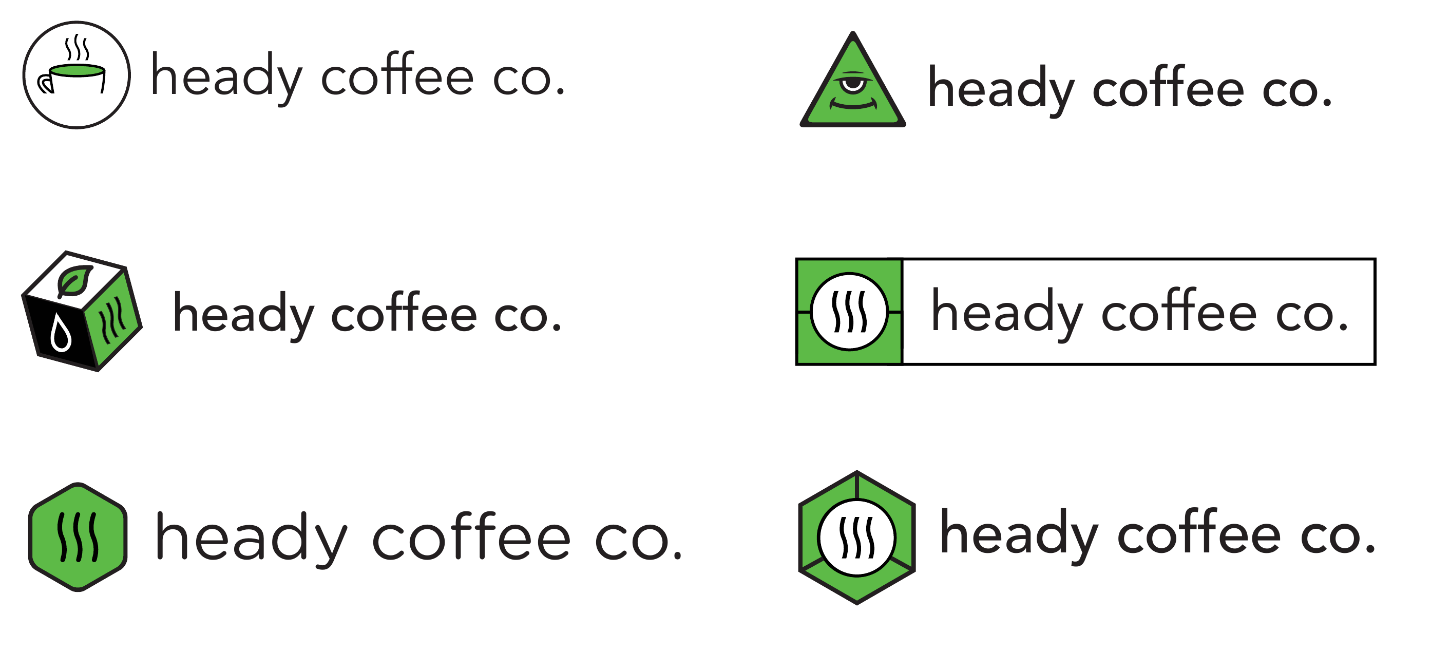
I ran the symbol wide before narrowing it. A literal cup of coffee. A to-go box with a leaf for something more roastery and earthy. A hexagon for a badge-like, technical feel. Even a playful, knowing take on the word heady itself, a calm third-eye face, leaning into the double meaning of a heady aroma and a heady buzz.
The literal options were safe but forgettable, and the punny ones were fun but pulled too far from the taco sibling. The winner was the quietest idea in the set: three rising waves of steam, the universal shorthand for a hot, fresh cup.
- Coffee cup, roast box, hexagon badge, third-eye pun
- Steam waves: simplest, most legible, most ownable
Steam, boxed like its sibling
The final mark is three steam waves inside a white circle, set into the family's green block with its black outline. It does a lot with very little. The steam says coffee instantly, it nods to the word heady, the rising head off a fresh pour, and the boxed-icon construction ties it straight back to McDevitt.
Set the two side by side and the relationship is obvious without a word of explanation. A taco in a green block, a steam mark in a green block. Same family, different appetite.
Choosing the corners and the voice
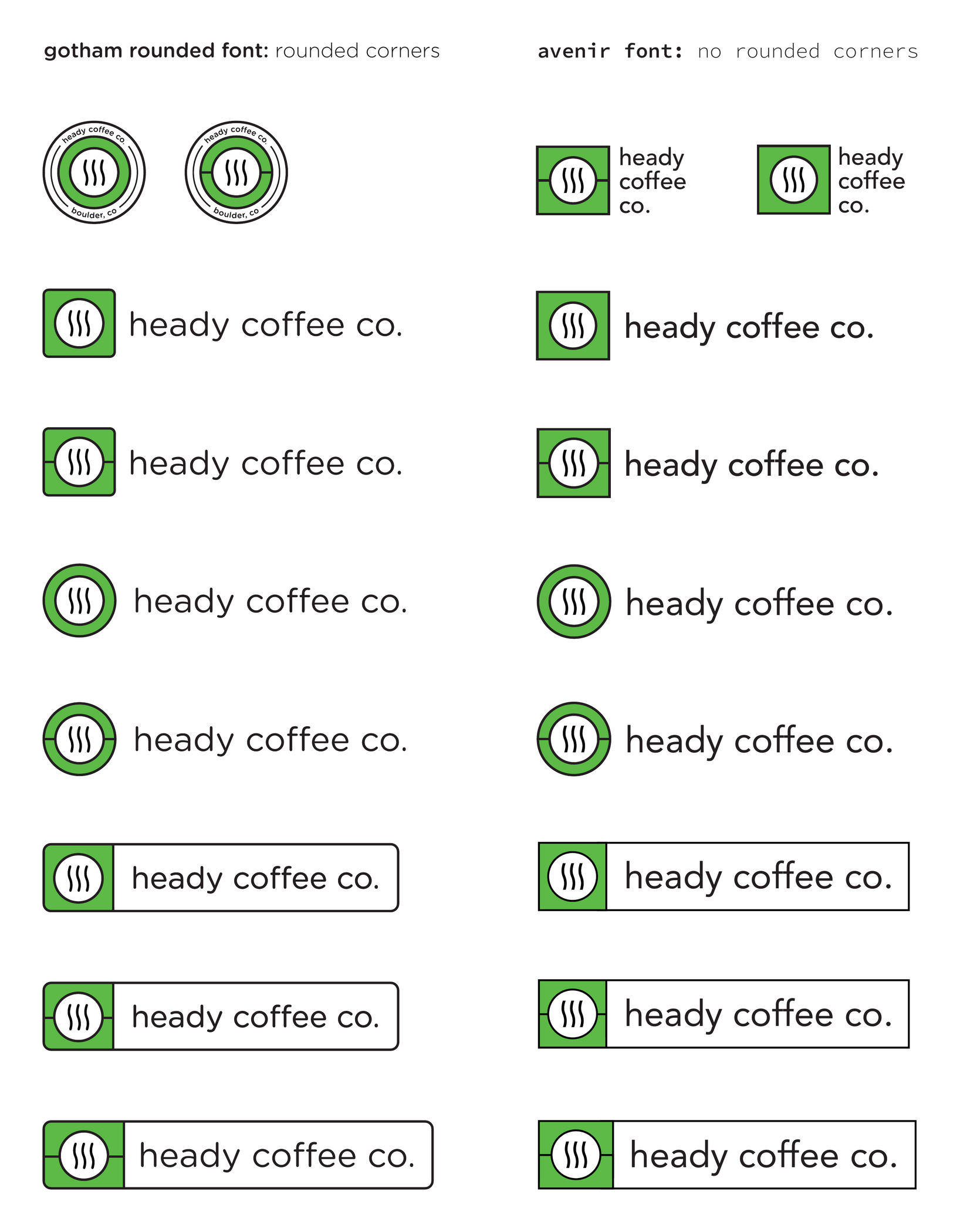
I tested two typographic directions. Gotham Rounded with rounded corners gave a softer, friendlier read. Avenir with sharp corners felt cleaner and more grown-up, closer in posture to the McDevitt mark. Heady went with the sharp, Avenir-set version, approachable but composed.
From there I built out the system: the icon as a standalone badge, a circle treatment, and the boxed lockup where the green block and the wordmark share one outlined bar. Every variant holds the same green, the same line weight, and the same calm confidence so the brand stays recognizable at any size.
- Avenir, sharp corners, over Gotham Rounded
- Standalone badge, circle, and boxed lockups
- One consistent green and outline weight throughout
A sibling, not a clone
The identity gives Heady a clear, confident coffee personality while keeping the visual handshake with McDevitt intact. The connection is felt, not spelled out, which is exactly what a sister brand should do.
It is also built to last: a simple, single-color-friendly mark that reads on a cup, a window, a sign, or an app icon, and a small kit of lockups that covers nearly any place the brand needs to show up.
Currently open to new roles
Let’s make somethingclear.
Senior, Staff, Lead, or Design Manager, if you’re untangling something complicated and want a designer who thinks in systems, I’d love to hear about it.