Switchfly: Book the room, keep the traveler.
Switchfly is the white-label booking platform behind major airline and card-issuer travel programs. Its hotel detail page is where travelers decide, and where too many of them were giving up. I redesigned the page end to end: the gallery, the information layout, how rooms and rates are displayed, and the multi-room booking flow.
A page doing everything, helping nothing.
The 2021 hotel detail page treated every piece of information with equal urgency, which is another way of saying no hierarchy at all. The photo gallery was a cramped carousel. The hotel description was a wall of text. And the room list was the real trouble: every rate variant rendered as its own full-size room card, so a hotel with six room types and a few rate options each became a list of 24 near-identical entries. Booking for more than one room? Every room's full list rendered on the page at once.
Travelers had to scroll, compare, and second-guess their way through duplicate-looking cards, and the analytics showed it: this step was where bookings died.
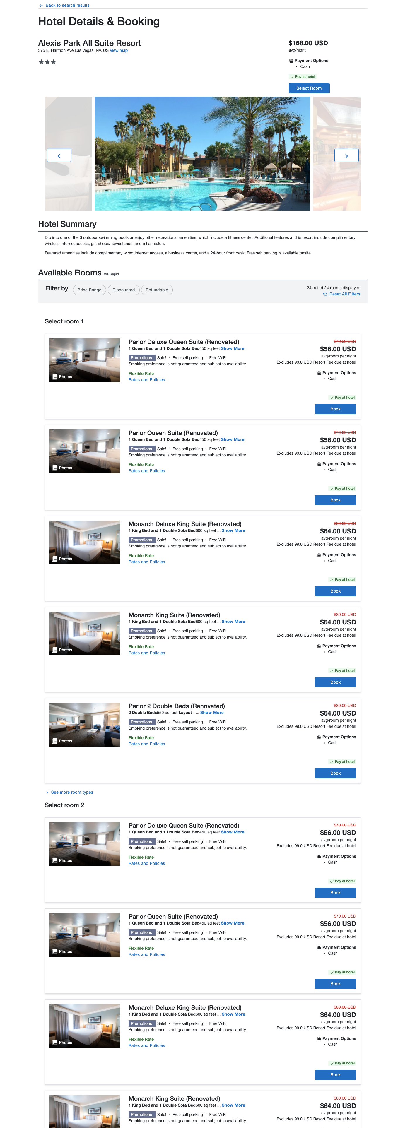
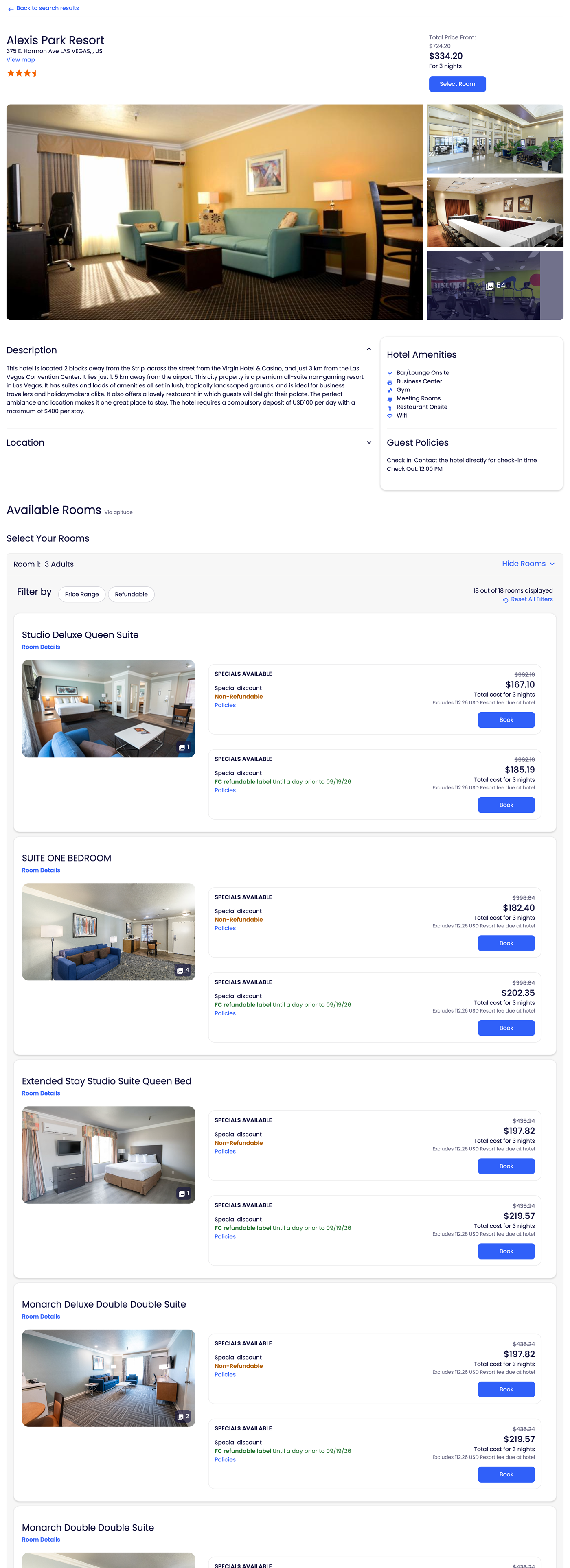
Image gallery: sell the room first
People book hotels with their eyes. The old gallery was a narrow carousel that showed one photo at a time and made you work for the rest. The redesign replaces it with a gallery grid: one large hero image, a column of secondary shots, and an honest photo count ("54") that invites exploration instead of hiding the inventory. More photography above the fold, fewer clicks to see it, and a page that starts by selling the stay rather than listing facts about it.
Information display: hierarchy over volume
The 2021 page presented the hotel summary as undifferentiated paragraphs, with amenities buried inside sentences. The redesign splits content by the job it does: a scannable description, an amenities card with icons, and guest policies pulled into their own panel, with secondary content like the location map collapsed until asked for. Travelers stopped reading to find out whether there's a gym; now they glance.
Room unification: one room, all its rates
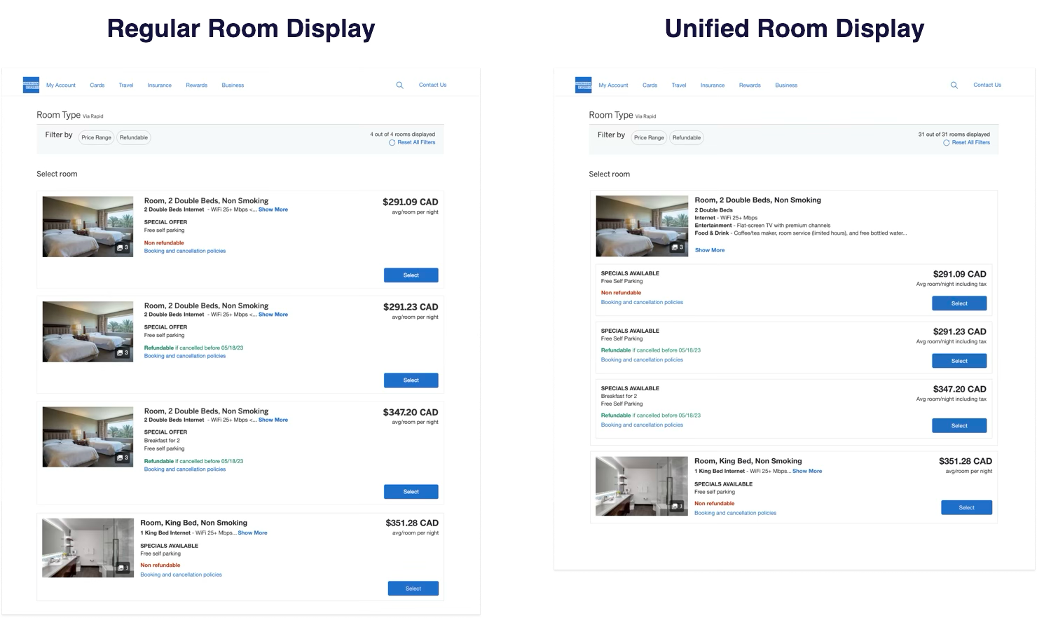
The structural fix. In the old model, a "room" in the list was really a room-and-rate combination: the same Double Queen appeared three times because it had three rates (non-refundable, refundable, breakfast included). Multiply that across room types and the list ballooned into dozens of cards that looked identical, differed in fine print, and forced travelers to diff them by eye.
Room unification inverts the model: one card per physical room type, with its rate options nested inside as compact rows. The room's photos and description appear once. Each rate row carries only what actually differs: the promotion, the cancellation policy, and the price. A hotel exposing 31 room-rate combinations now reads as a handful of rooms, each with a clear menu of ways to book it.
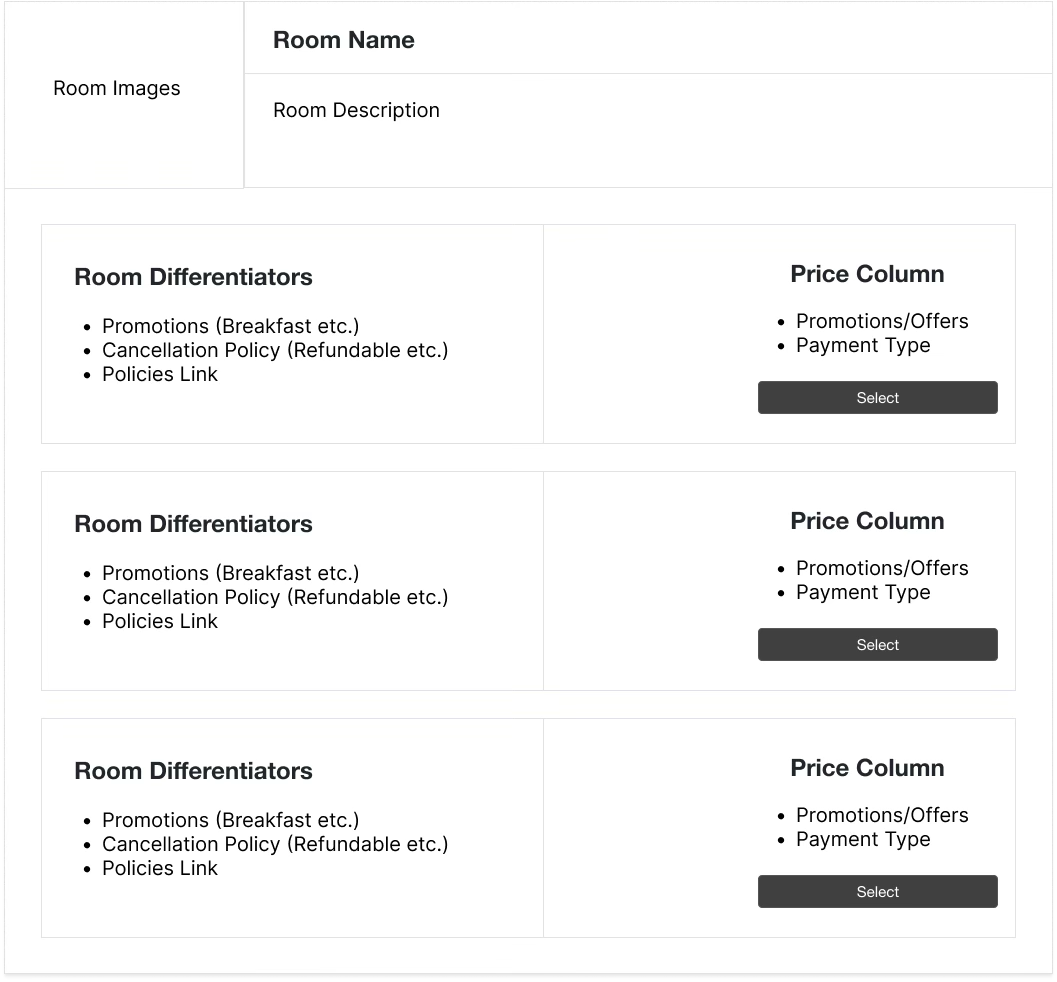
The wireframe is the whole argument. Everything that describes the physical room lives once, in the header: photos, name, description. It never repeats, so it can never disagree with itself.
Below it, each rate is a compact row built from only the things that actually differ: the promotion, the cancellation policy, and the price. Every row keeps its own Select button, so choosing a rate is one click, not a comparison exercise.
The structure also scales in both directions: a room with one rate reads as a simple card, and a room with six rates stays one card tall instead of six.
Multi-room selection: one decision at a time
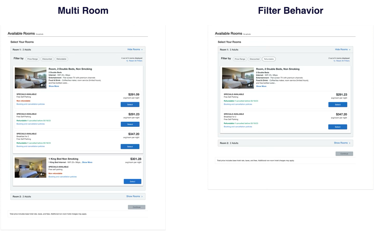
Booking two rooms used to mean confronting two complete room lists stacked on a single page, with no sense of progress and no summary of what you'd picked. It put the entire decision space in front of the traveler at once, which reads as thoroughness on a spec and as chaos in a browser.
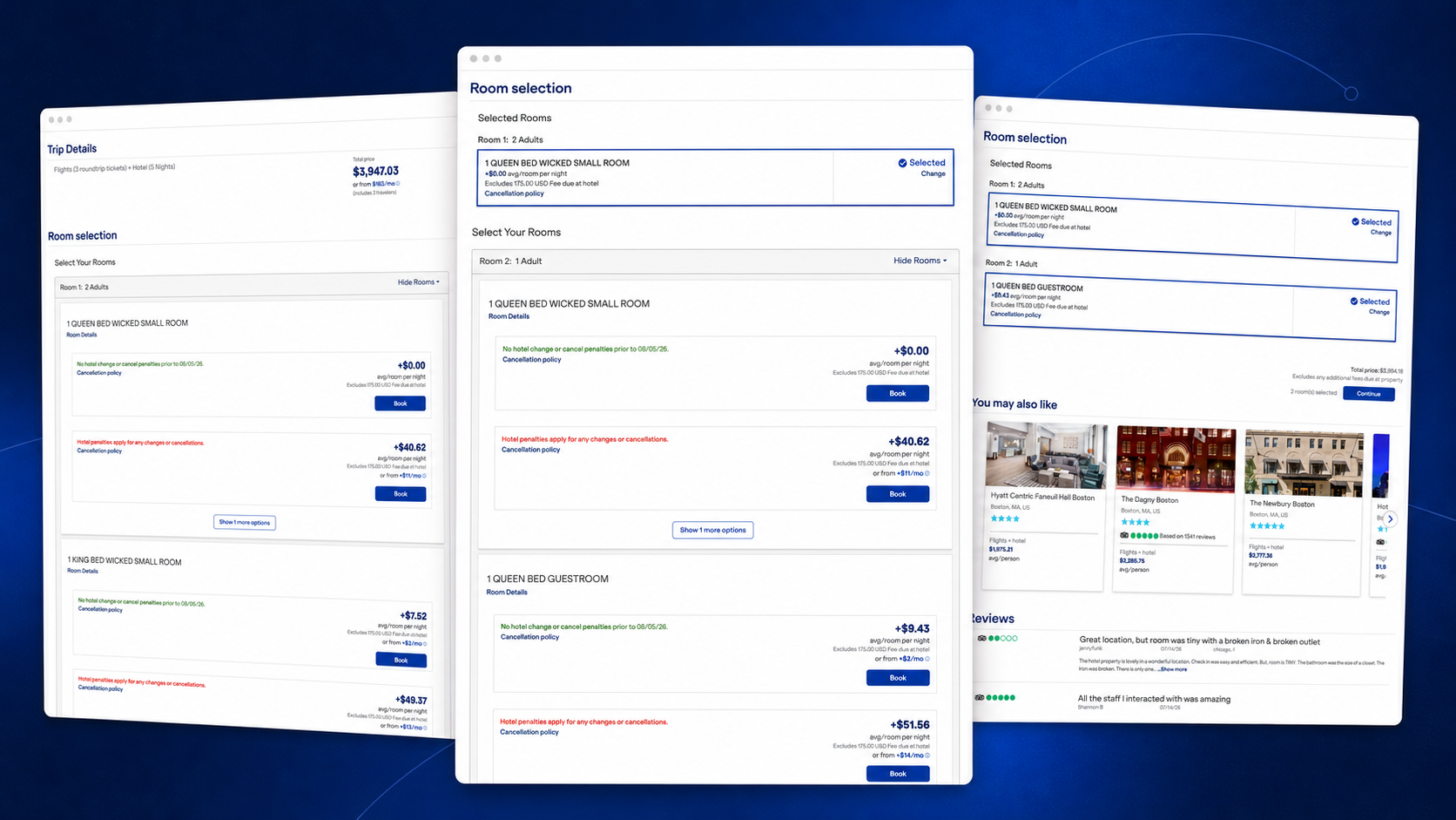
The redesign turns multi-room booking into a guided, one-room-at-a-time flow: Room 1 opens as an accordion, you pick a room and rate, it collapses into a confirmation with a Change link, and Room 2 expands. A running summary keeps every selection visible and editable, and the Continue button activates only when the party is fully housed. Same choices, sequenced, with the traveler always knowing where they are.
Fewer travelers walked away.
Following rollout across partner storefronts, abandonment on the hotel detail and room selection step dropped substantially: travelers who previously gave up at this point now make it through to checkout. On a platform processing bookings at airline-loyalty scale, that's not a rounding error; it's a revenue line.
- One card per room type ended the duplicate-card comparison problem that dominated support feedback.
- The guided multi-room flow gave group bookings a visible finish line, where the old page gave them a wall.
- Because Switchfly is white-label, every partner storefront inherited the improvements from a single design system change.
Want the longer version?
Happy to walk through the research, the dead ends, and the calls I’d make differently now.