Brew Guru: A homebrewer's app, refocused.
Brew Guru is the American Homebrewers Association's mobile app: member deals, recipes, articles, and a map of every brewery worth a detour. In 2019 I partnered with the client, a product manager, and a single engineer to redesign and rebuild it in React Native, letting research and analytics decide what the app was really for.
The home screen was doing too much.
User testing showed members found the Home screen overwhelming, but they consistently valued two things: local deals, and quick access to the membership card they used to redeem them. Analytics agreed: Deals was already the most-used feature buried inside Home.
When the data and the interviews both point at deals, you stop defending the home screen and start building the deals screen. We replaced Home with a focused Deals experience: a clearer, more purposeful front door that also set the pattern for how everything else in the app would be organized.
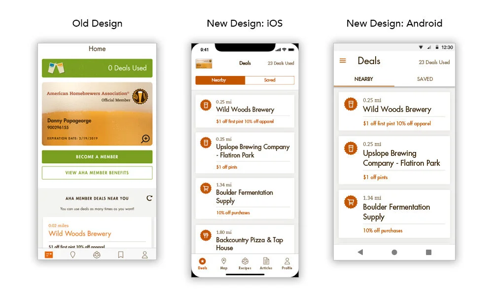
Every section earned its place
With Deals promoted to the front, the rest of the app was reorganized against real usage instead of org charts. Articles had low overall engagement, but the analytics showed the people who found it came back often: a small, loyal audience. So instead of cutting it, we raised its visibility to test whether exposure could grow sustained adoption.
Saved Items left the primary navigation entirely and moved into the places it was actually used, inside Deals and Recipes, with native platform controls so saving felt familiar on each OS. And Recipes gained at-a-glance meta showing how many styles and recipes sat under each beer category, so people could decide where to explore before diving in.
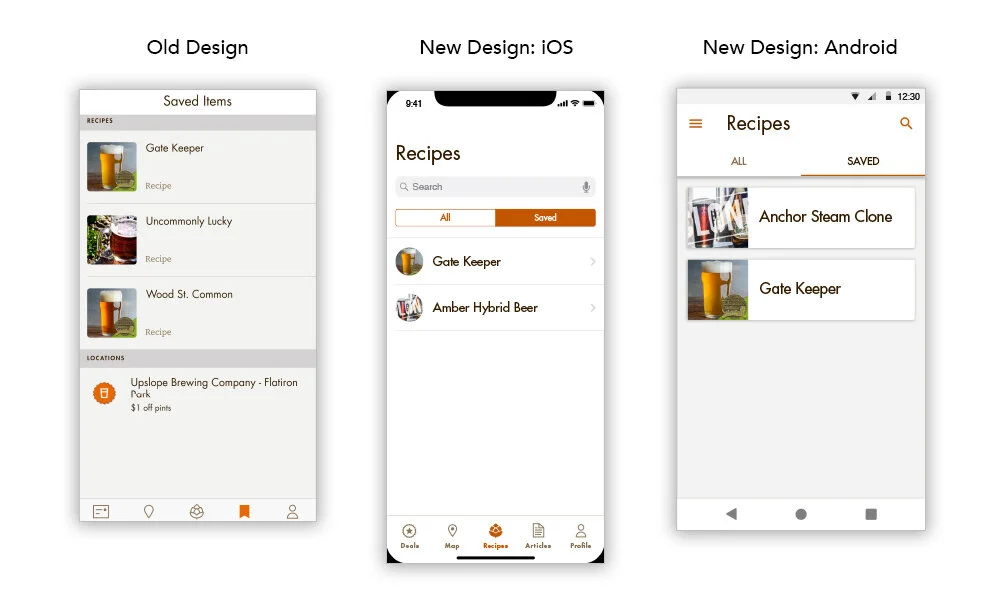
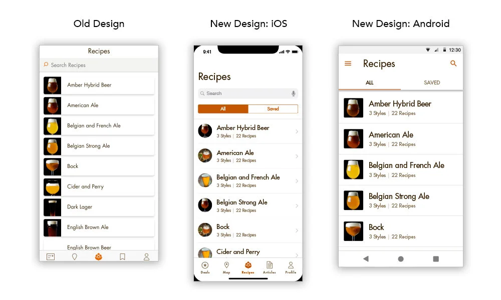
One location card, reused everywhere
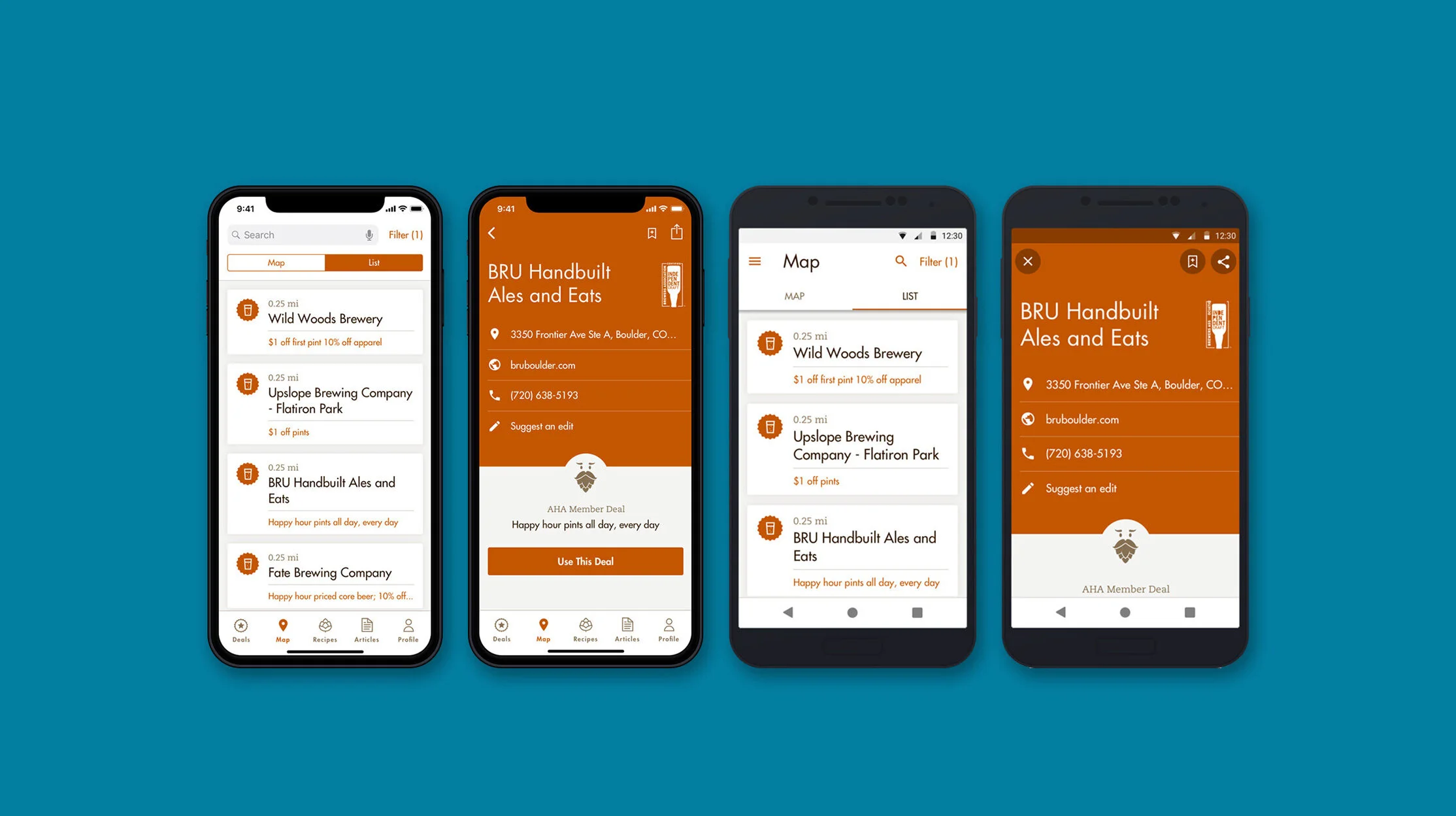
The most leverage came from a single component. I redesigned the map location card into one reusable card shared by the map, the list view, and the Deals experience: location type through iconography, name, distance, and any available member deal, all at a glance.
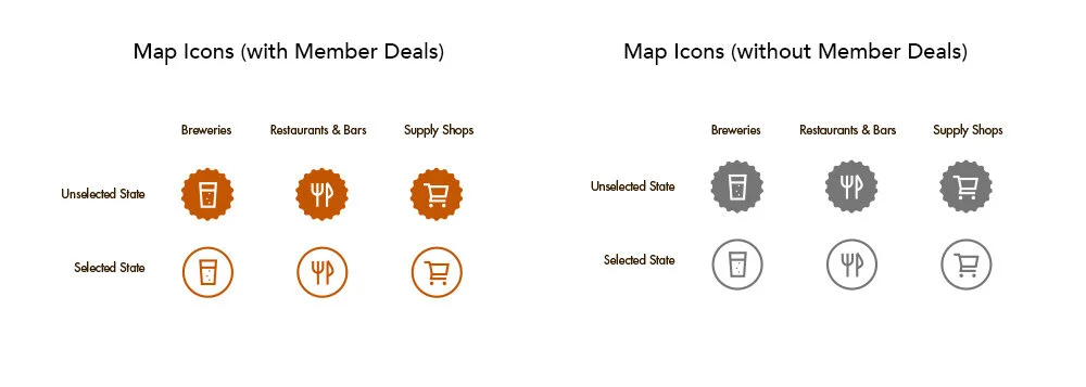
Location icons were enlarged and simplified for scannability. Locations without a member deal use the same icon shape in neutral gray, so color alone signals deal availability while the system stays visually consistent. Location detail pages got the same treatment: supporting iconography, clearer hierarchy, less to parse.
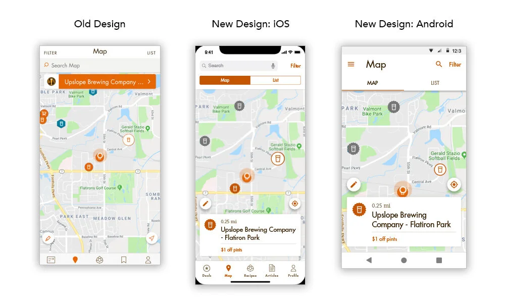

Foundations: accessible color, tighter type
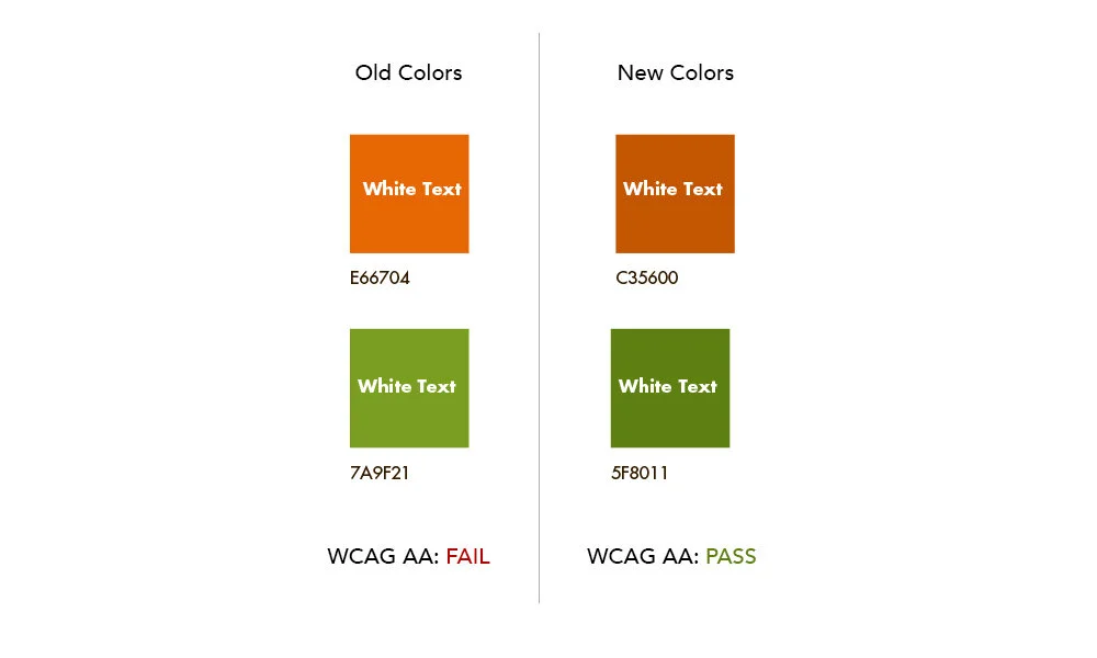
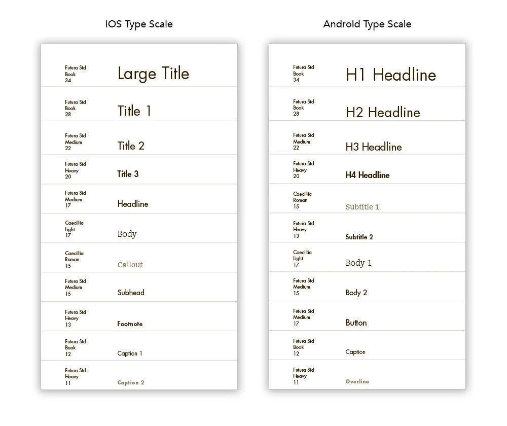
Underneath the features, the system got stricter. The app's primary orange and green were updated to pass WCAG AA. The typography, which had sprawled past twenty styles, was consolidated to eleven, with names aligned to iOS and Android platform conventions.
On a team of four, that shared language was the multiplier: design and engineering called things by the same names, the React Native build went faster, and handoff friction mostly disappeared.
A focused app people kept rating well.
The redesign traded a crowded home screen for a clear, deals-first experience backed by a consistent system, and it aged well: Brew Guru ran for four more years on the foundation this small team built.
In 2023 the AHA retired the app, not because it failed, but because its core features had proven valuable enough to graduate into the Association's mobile-friendly website, where every member could reach them without an install. That's the good kind of sunset: the product ended, the work carried on.
- Let usage pick the home screen. Leading with Deals wasn't a hunch; it's where research and analytics already agreed.
- On a tiny team, systems are a force multiplier: one reusable card and one type scale did more than any single screen.
- Platform-native patterns from a shared codebase kept both OSes feeling right without doubling the work.
Want the longer version?
Happy to talk through what we cut, what we kept, and how it held up over four years.